10.29.20
Hold the Phone: Is Your Website Mobile-Friendly?
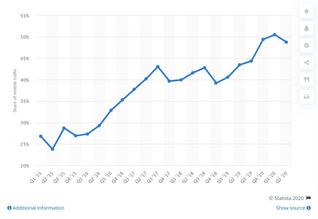
Fifteen years ago, the smartphone didn’t exist. Back then, a phone was just a phone. You could call someone (remember memorizing phone numbers?) or you could send them text messages of up to 160 characters. You were lucky if you had a low-resolution game like Snake or Tetris. Nowadays, most people’s phones are really tiny computers that are more powerful than the computers that took us to the moon. As of 2020, 50% of your customers are using those pocket computers to view your website, so it’s immensely important to provide a mobile-friendly experience to your customers. Is your website mobile-friendly?
Adaptability
There was a time – a time not too long ago – when the only way to browse the Internet was on a computer. Moreover, those computers used monitors with minimal variation in screen size. But now, we have small tablets, even smaller smartphones, and giant 4K gaming monitors. We have to design websites to be adaptable to all screen sizes so each visitor has a great experience.
Some website designers accomplish this by serving a mobile version of their site, or by strictly adhering to a “grid”, which simply stacks content when the viewport gets too small. This works, but we prefer a more bespoke approach, one where we view a design from every screen size and determine what will work best for each.

Legibility
One of the trickier aspects of making your website mobile-friendly is ensuring that all text is legible for viewers. Counterintuitively, the smaller that the viewport is for your website, the larger the text needs to be. This is because relative to a computer screen, most people hold their phones much further away from their eyes to view it.
Something you never want to require of your site visitor is to “pinch” to zoom on your website. This affects the layout of the site, making for a confusing and frustrating experience. Ideally, a mobile-friendly website design should always fit in the viewport of whatever device is being used.
Capability
Finally, and arguably the hardest part about making your website mobile-friendly is minimizing the amount of time it takes to load the website. Of your mobile site visitors, most of those people will be viewing it over a mobile data connection. If it takes too long for your website to load, many viewers will balk before the site finishes loading.

There’s a delicate balance between using high-quality assets on your website and reducing their file size. Luckily, there are some important tips and tricks to find that balance. These include “caching” your website, which reduces the time it takes for your hosting server to render your website, optimizing images and video, and more.
Conclusion
The invention of the smartphone put the power of a computer in everyone’s pockets. Now that half of all web traffic comes from phones and tablets, it’s essential to ensure that your website is adaptable, legible, and capable for this half of your audience. Not sure if your website is mobile-friendly? Contact us today to see how you can better accommodate your mobile customers!
RECENT POSTS

Leverage Social Media Ads to Boost Your Brand’s Visibility and Drive Results

Elevate Conversions with Expert Landing Page Optimization Strategies