02.19.20
3 Ways to get more leads from your Contact Form
Do you have a contact form on your website? Does it look like this?
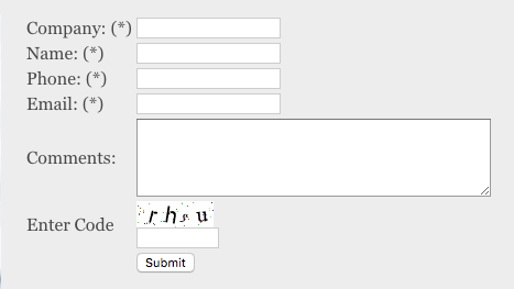
I am going to go out on a limb and say that you probably don’t get many leads from this form (if any), and you might be thinking that it is pointless to even have a contact form because you don’t get any new submissions.
Before you give up on your contact form and curse your web designer for putting such an abomination on your website, check out our three tips to increase the amount of form fills on your website without increasing your marketing spend.
Tip #1: Make it engaging
For this tip, instead of doing the traditional “Name, Email, Phone, Comments”- incorporate some of your brand elements to make the user participate and feel more engaged in the process of getting in contact with you.
For example, we recently made icons to represent our client’s service offerings and used those icons on their form for users to select which service they are looking for.
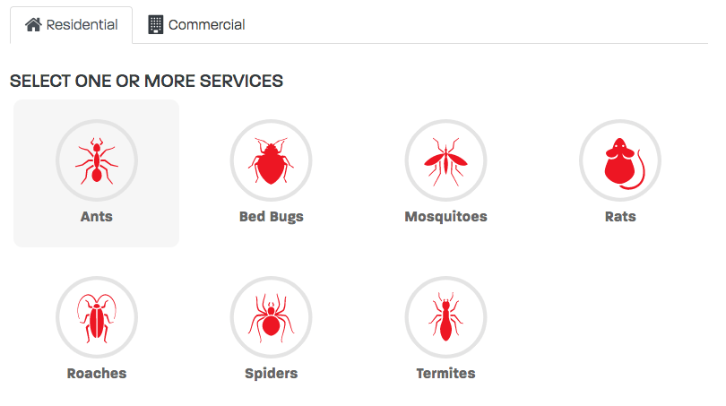
Why this works – people are on your site for a reason, they want to get in touch with you, they have a problem that you can potentially solve for them, and you are allowing them the opportunity to pick and choose how you can best help them. Instead of the “fill this out, now fill this out, don’t forget this one, then hit submit and never hear from them again approach. You can be one of the companies that stands out from the crowd and leaves the user feeling charmed. Then you respond to this person and you both feel excited about the new opportunity to do business… you could get a new customer for life. What’s the value of that?
Tip #2: Have fun with it
What I mean by this is, don’t fall into the trap of doing something generic like “Get in Touch” of “Contact Us” in your navigation. I am sure we are all guilty of this at some point, but there is not a more glazed over call to action than one of these.
If you have a company saying, a bold statement, or something that is just a little out there, then go for it. This is a great way to get a user’s attention when on your website. Below are some examples of eye-catching navigation buttons that lead to the contact page:
Tip #3: Calculate it
Depending on how comfortable you are with sharing your prices and if you have an equation you use to come to a price for your service offering you could basically make your form a giant calculator for people to fill out. This accomplishes 2 things:
- The user gets an estimate on the service you provide
- You get this user’s contact information and account details at the same time.
There you have it, three tips you can implement to start improving your website’s contact form and increasing leads to grow your business. If you would like any help generating more leads from your website, it is literally what we do.
RECENT POSTS

Leverage Social Media Ads to Boost Your Brand’s Visibility and Drive Results

Elevate Conversions with Expert Landing Page Optimization Strategies